Who is Tiago Patrício Rodrigues?
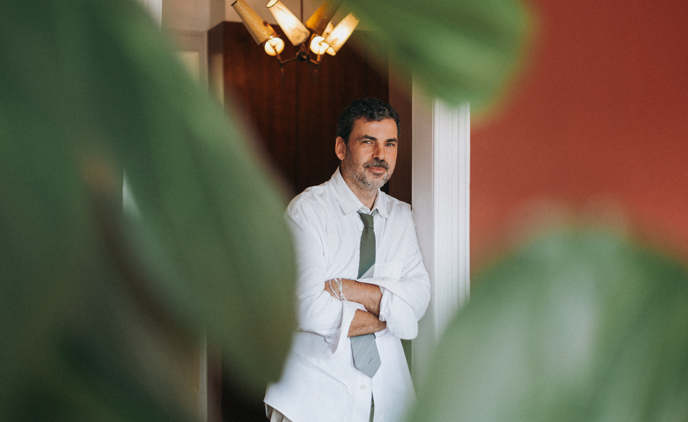
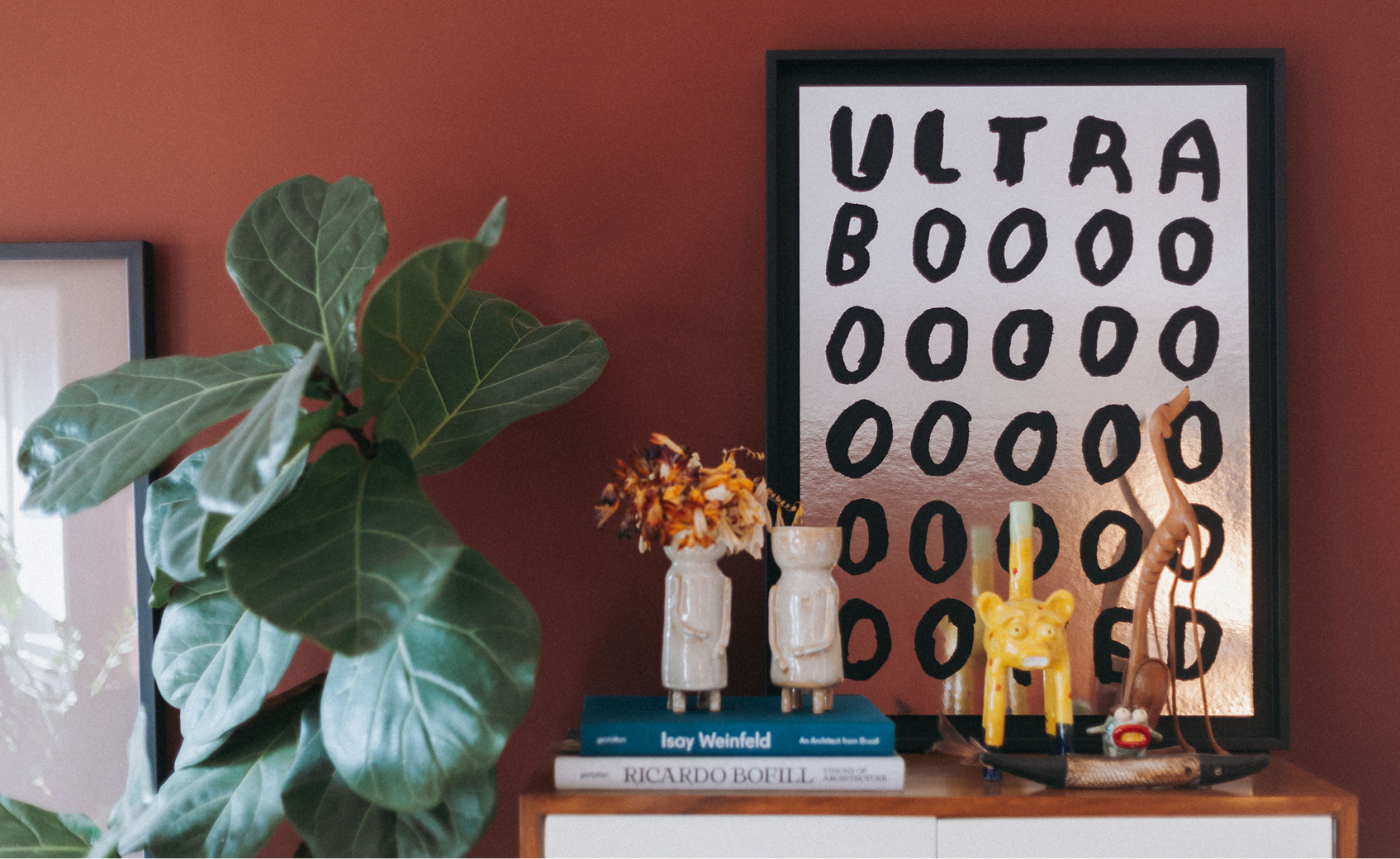
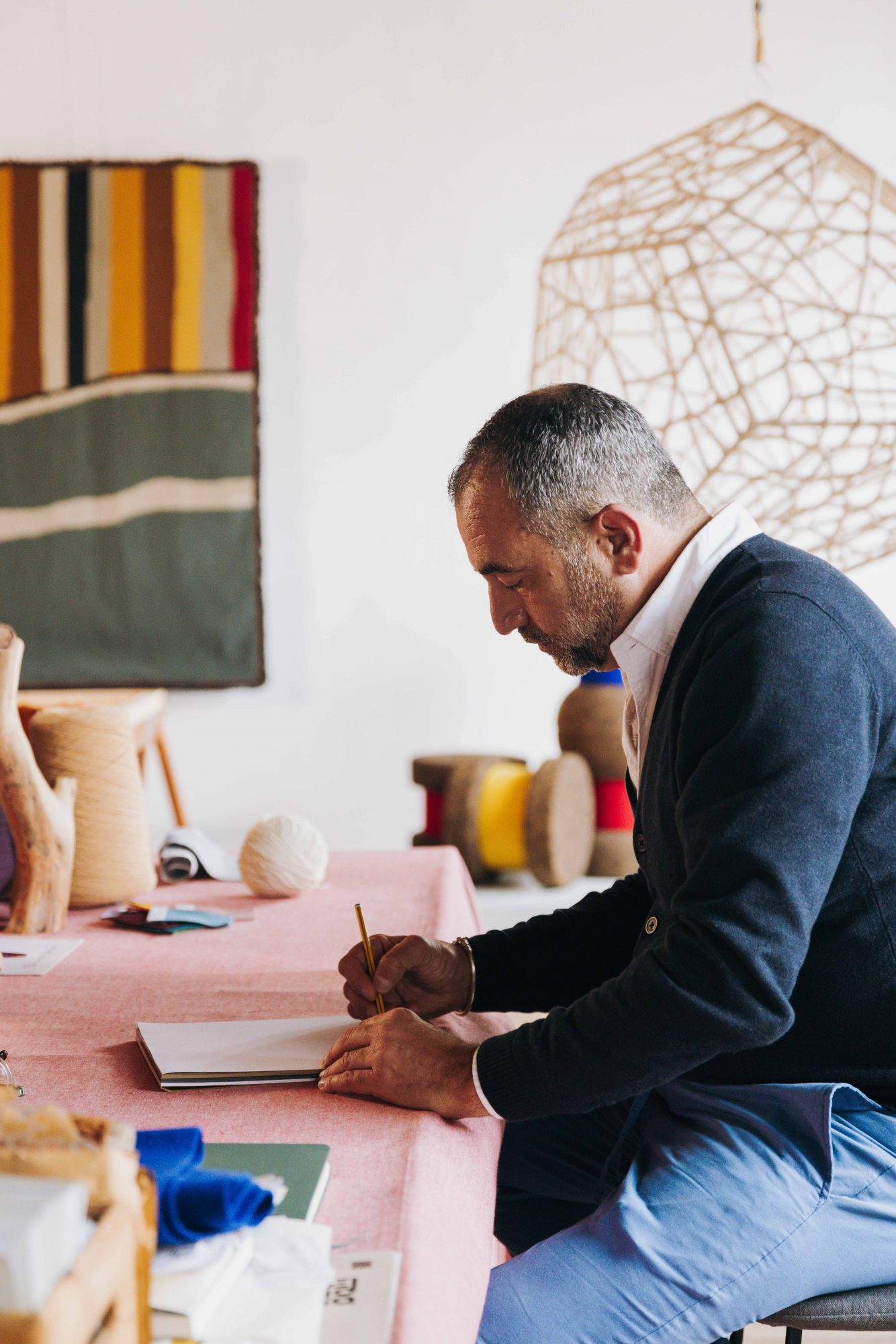
My name is Tiago Patrício Rodrigues, and I’m an architect specialising in interior design. I studied here in Lisbon, at the Faculty of Architecture, and after graduating I went to Brazil, where I worked with architect Isay Weinfeld. When I returned from that experience, I founded my own practice and, a few years later, together with my partner João Vilela, I created Pura Cal, and since then, our work has been entirely dedicated to designing spaces and objects.
How did Pura Cal come to life?
Pura Cal began with the idea of creating spaces with more soul and character – places that feel alive. At the same time, from the very start, we wanted to design and promote objects with a strong artisanal quality, each one unique. In essence, we saw Pura Cal as a response to a gap in the market –one that we still believe exists– for people who seek something more singular, more meaningful.
On your website you write: “They say we’re architects. They say we’re interior designers. They say we sell decorative pieces. They say many things about us, and we’re proud of the way they say it. We are all of this. But it’s not what defines us.” What does define you?
What truly defines us is the intention behind what we create – spaces with soul, with emotion. That’s our métier. We work closely with the emotions of our clients, and also with the emotion that a space or an object can evoke. It’s always about creating an emotional connection.
We can say that Pura Cal is born from a fusion between architecture, design and emotion. When you look at a blank space, what’s the first thing you try to feel before you begin creating?
We always start by understanding the identity of the space: its story, the periods it’s lived through, its materials, its light, its essence. Then, together with the programme we’re developing, we weave all these layers into a concept, building an imaginary that connects past, present and future.
Your aesthetic feels deeply rooted in the history of places – in their colours, scents and heritage. How does that emotional connection become a visual language? What’s your creative process like?
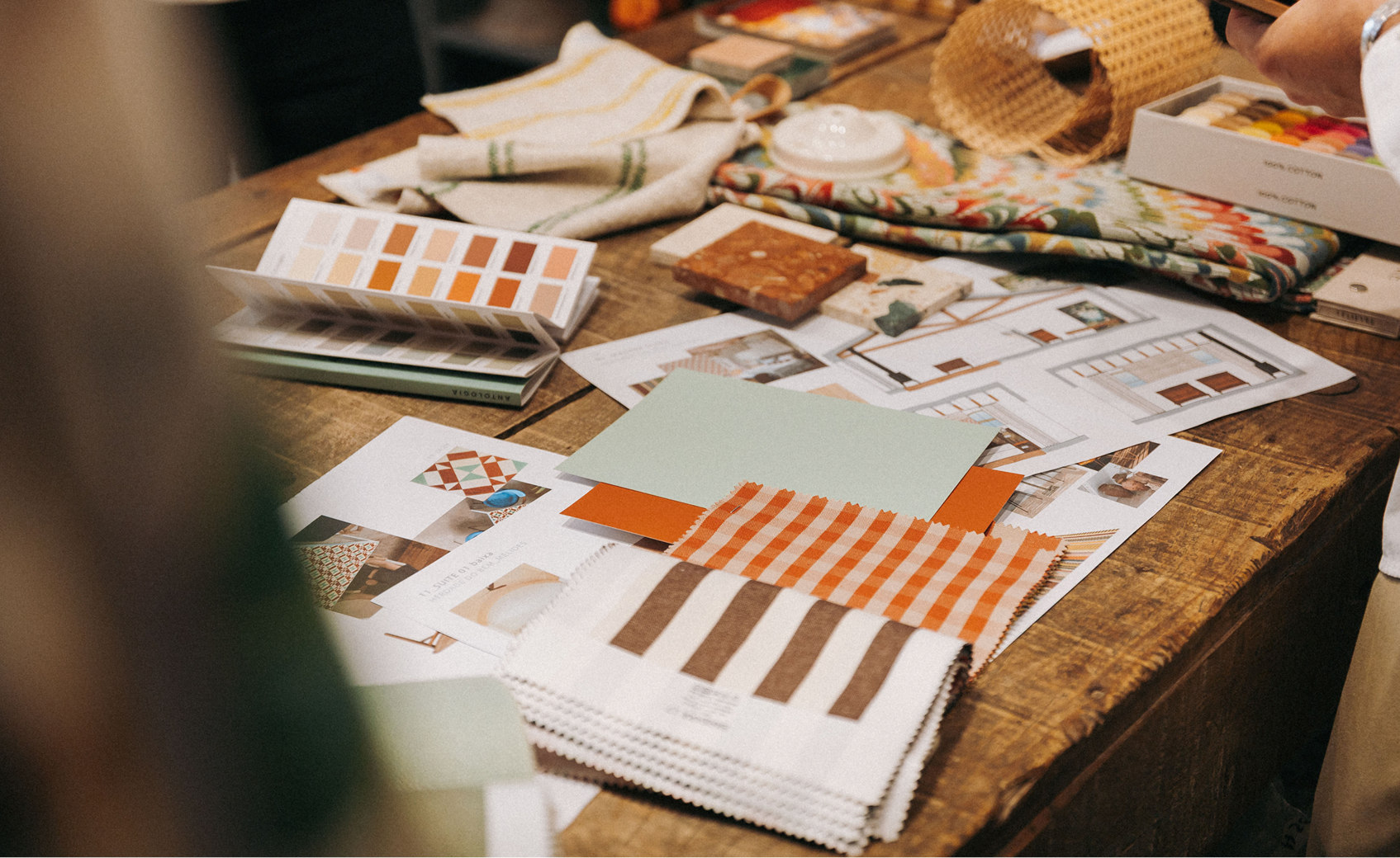
The creative process changes a lot depending on the client and their intentions. But in general, it’s all about building connections – linking elements that may not be visible at first, but that can be felt. The way materials, colours and objects interact; the dialogue between different times and memories. We try to bring these layers together, drawing on references from many eras.
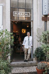
How does your own studio space reflect your creative philosophy?
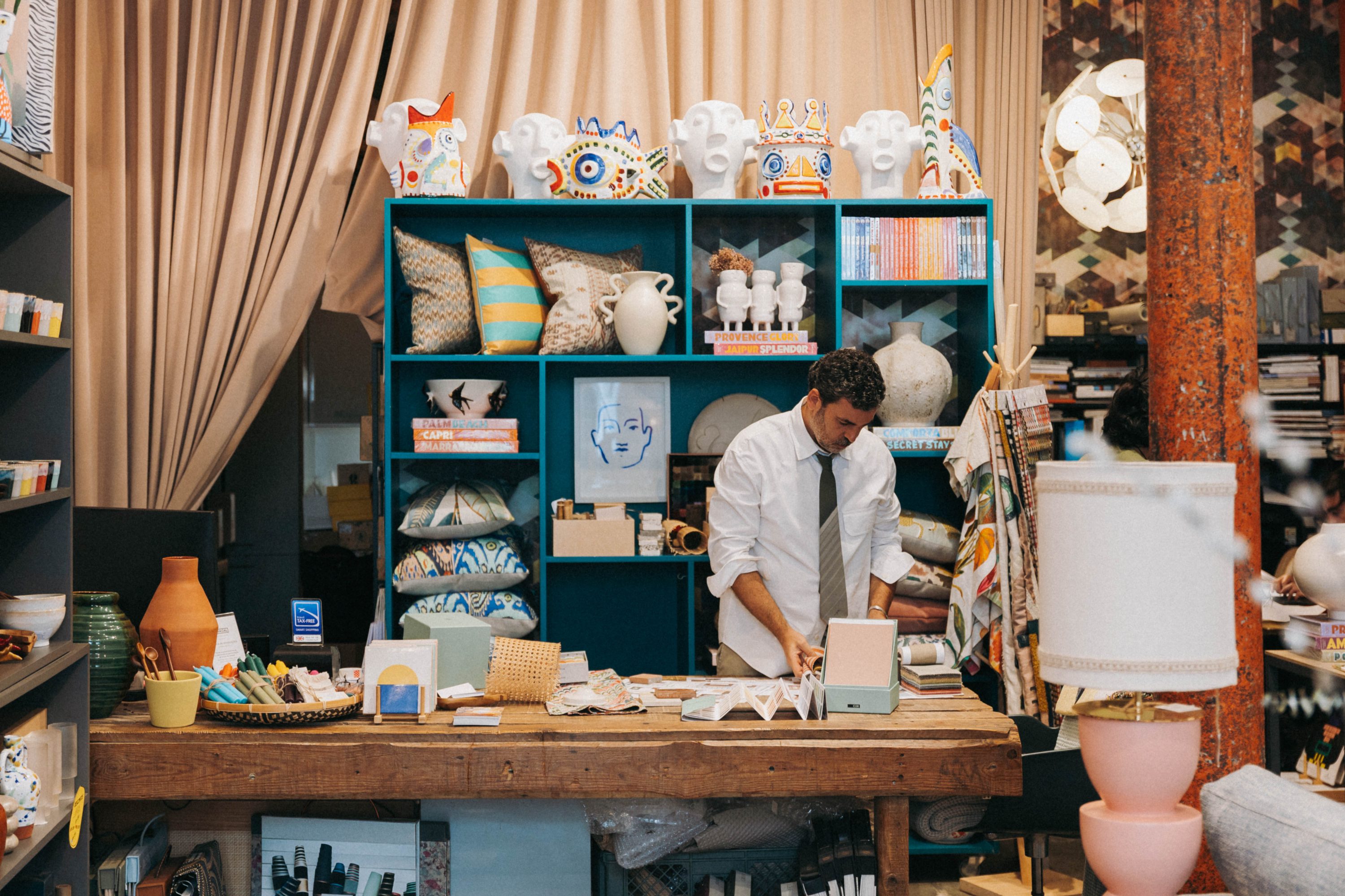
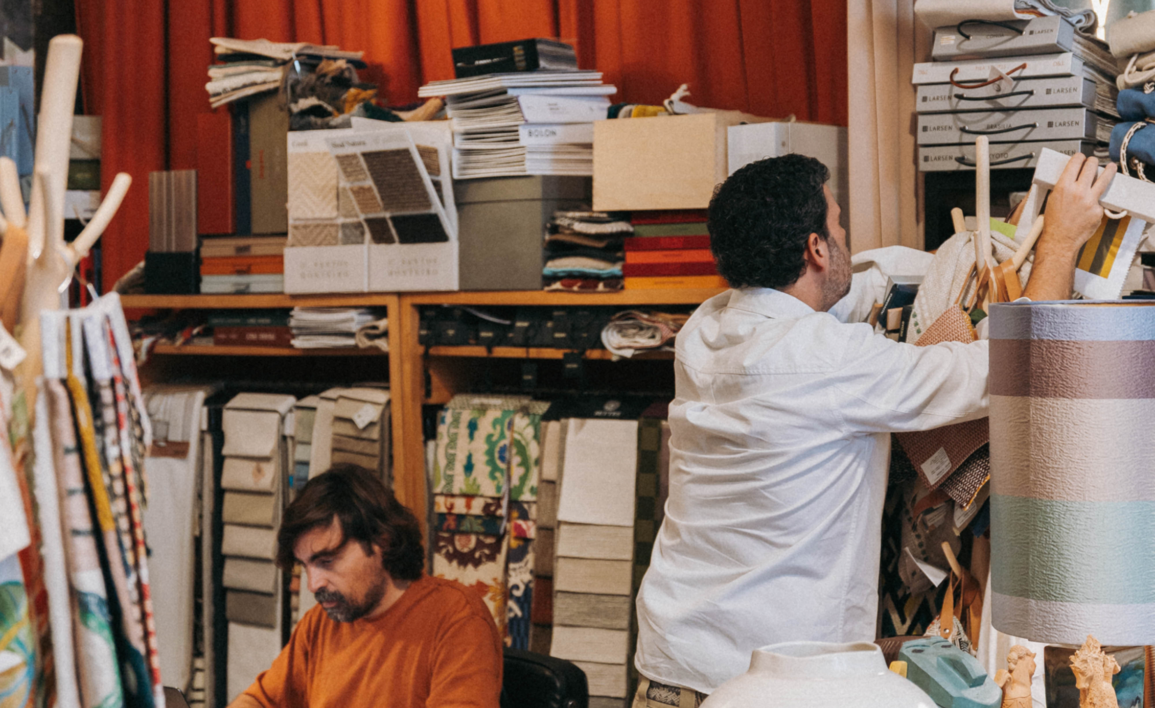
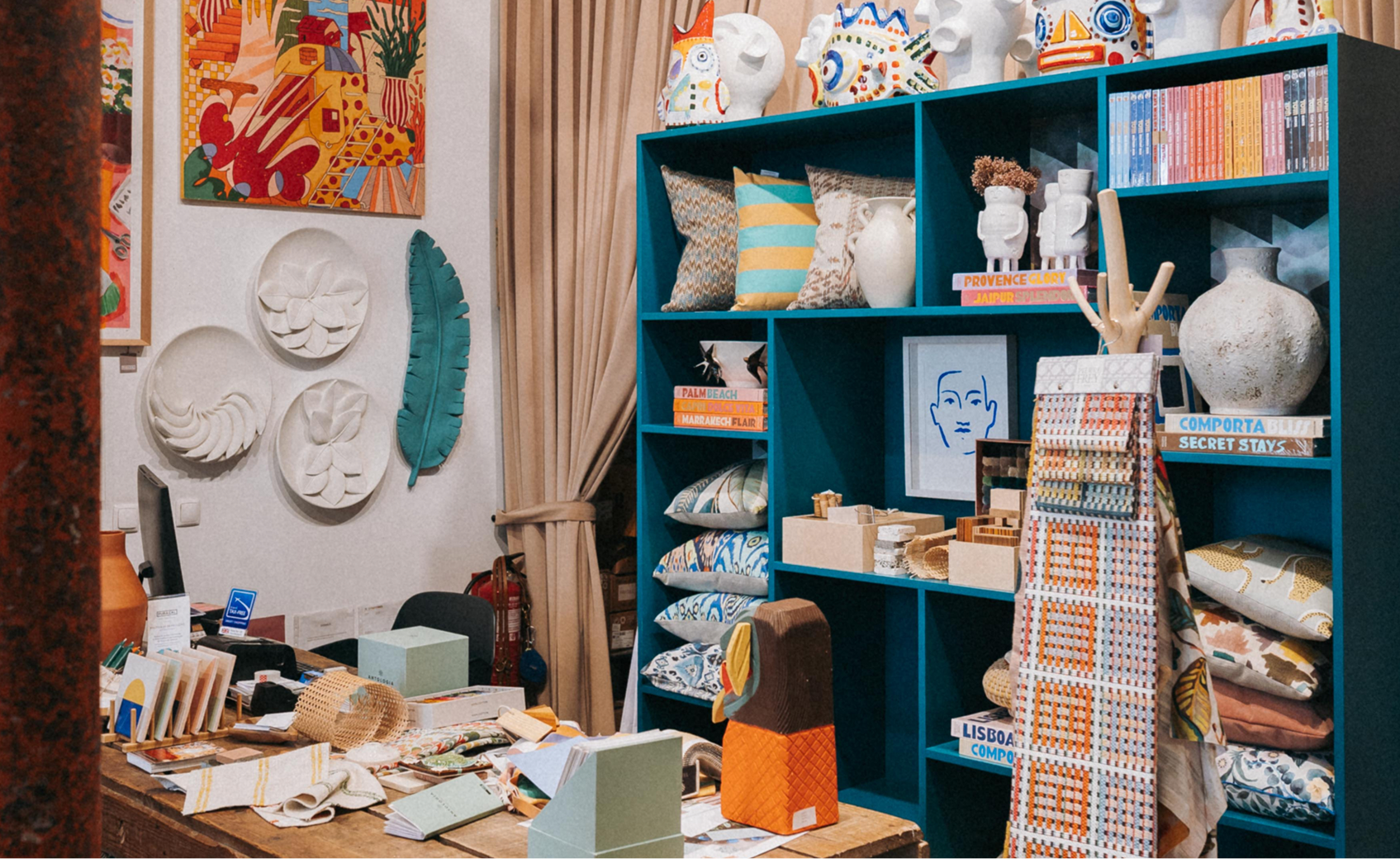
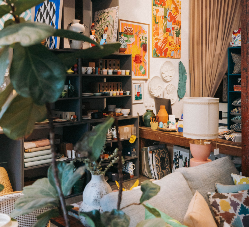
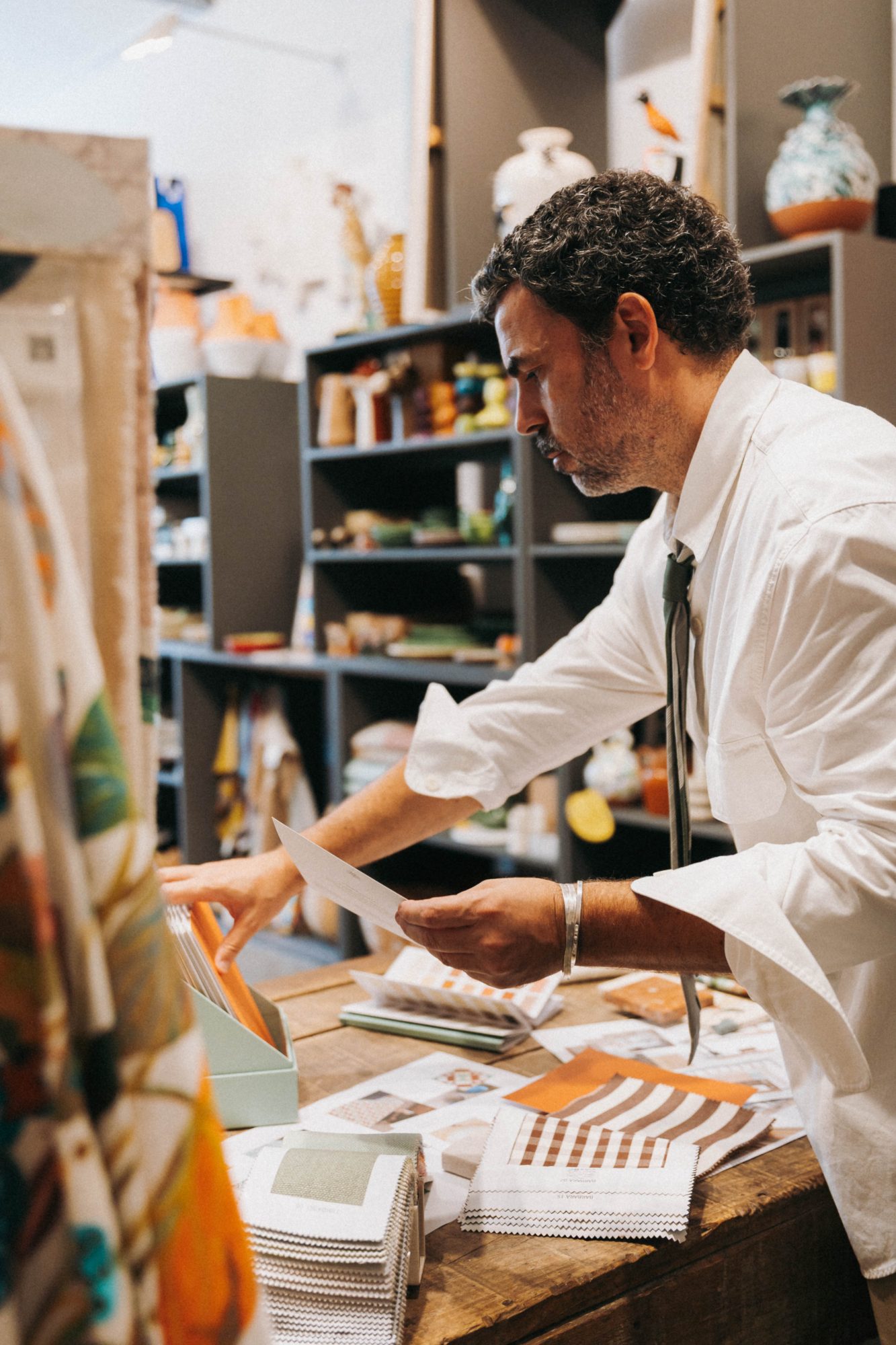
Our studio is a bit like our minds: wonderfully chaotic, full of materials, references and ideas. It reflects our way of being: mixing objects and textures, working closely with artisans, embracing the tactile, the handmade, the imperfect. It’s a space full of life and colour, and people who visit – clients or friends – are often surprised and delighted by the mix, by how it all comes together so naturally.
You also see yourselves as storytellers, and Pura Cal has told many stories. Is there a project that’s stayed with you in a special way?
The projects where we build a deeper connection with our clients are always the most meaningful, because we’re able to go further into their ideas. Recently we completed a family beach house, originally built in the 1950s. It was a very special project because we worked on everything, from architecture to interior design, and it allowed us to explore the roots of that family’s story.
We’ve also done hospitality projects, which are completely different because you’re not designing for one person, but for an experience, a lifestyle. That’s fascinating too. You’re creating spaces that will generate memories. It’s almost the reverse process: instead of recovering people’s memories, we’re projecting new ones into them. That’s a beautiful challenge – creating places that stay with people long after they’ve left.
What role does colour play in your creative process?
For me, colour is life. There’s no space without it. People often associate our work with bold use of colour, but in truth, we don’t always use a lot of colour in the architecture itself. It comes through in the objects. We design many colourful pieces, which we use to bring contrast and vibrancy to the spaces.
How do you see the use of colour in Portugal?
In Portugal, people tend to use colour more on the outside than inside. Our cities are incredibly colourful – façades painted in pinks, yellows, blues – and visitors are always amazed by that. Our old palaces too, full of life. But once you step indoors, everything becomes much more monochromatic.
If you had to describe Antologia collection to someone, what would you say about this catalogue?
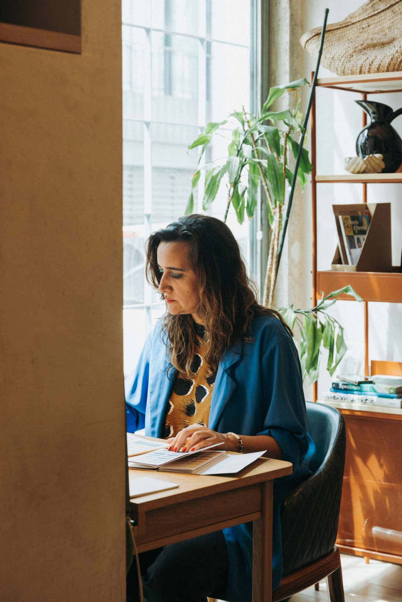
For us, it’s a very useful catalogue because the colours are beautifully balanced, and they mix and complement each other effortlessly. At the same time, the palette feels very sophisticated: subtle shades that are hard to define. And the quality is remarkable – matte paints usually mark easily, but Antologia’s finish doesn’t. That’s essential for us, especially when working with darker, matte tones where scratches are more visible. It’s a product with a real sense of quality.
Can you choose three colours from the Antologia collection that perfectly match your aesthetic?
Personally, I love the earthy tones. The yellows are stunning – I haven’t used any yet, but they’re all beautiful. There are also some incredibly vibrant blues. The catalogue is full of shades I love. Of course, we end up using some more than others, but honestly, I couldn’t pick just one.


