Joana – architect, designer, artist. How would you introduce yourself and explain how it all came about?
My name is Joana Astolfi and I’m an architect, designer and artist. Quite the mix, right? It’s a very hybrid identity. I studied architecture in the UK and spent over a decade abroad, gaining perspective and life experience. I also lived in Italy, where I joined the Think Tank team at Fabrica — an immersive, life-changing process.
At first, I was torn between art and architecture. Then I had a conversation with my father, who is also an architect. He told me — without pushing me either way — “If your passion is equally strong for both, go for the one that gives you a solid foundation. You were born with the art — it will always be with you.” That advice opened many doors.
During my six-year degree in London and Wales, I also fell in love with product design, with working on a smaller scale, with objects, details — like designing carpentry in fine detail. That’s when this whole loop began that later became Studio Astolfi.
And in the beginning, you didn’t set out to build a studio or lead a team?
Exactly. I had no ambition of creating a studio, let alone with a big team. I started out solo, driven by that same hybrid mindset. After returning from Fabrica — my last stop abroad — people kept asking me, “What are you exactly? An architect? A designer? An artist? What do you actually do?” And the answer is: I’m a bit of all that. Back then, this kind of hybridity wasn’t so common. Today it’s more accepted, but I’ve always stayed true to this cross-disciplinary nature.
I grew up with a gallerist mother and an architect father, so that blend was already there in my upbringing, in my teenage years. Those influences were fundamental.
What were the early days of Studio Astolfi like?
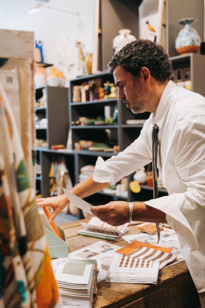
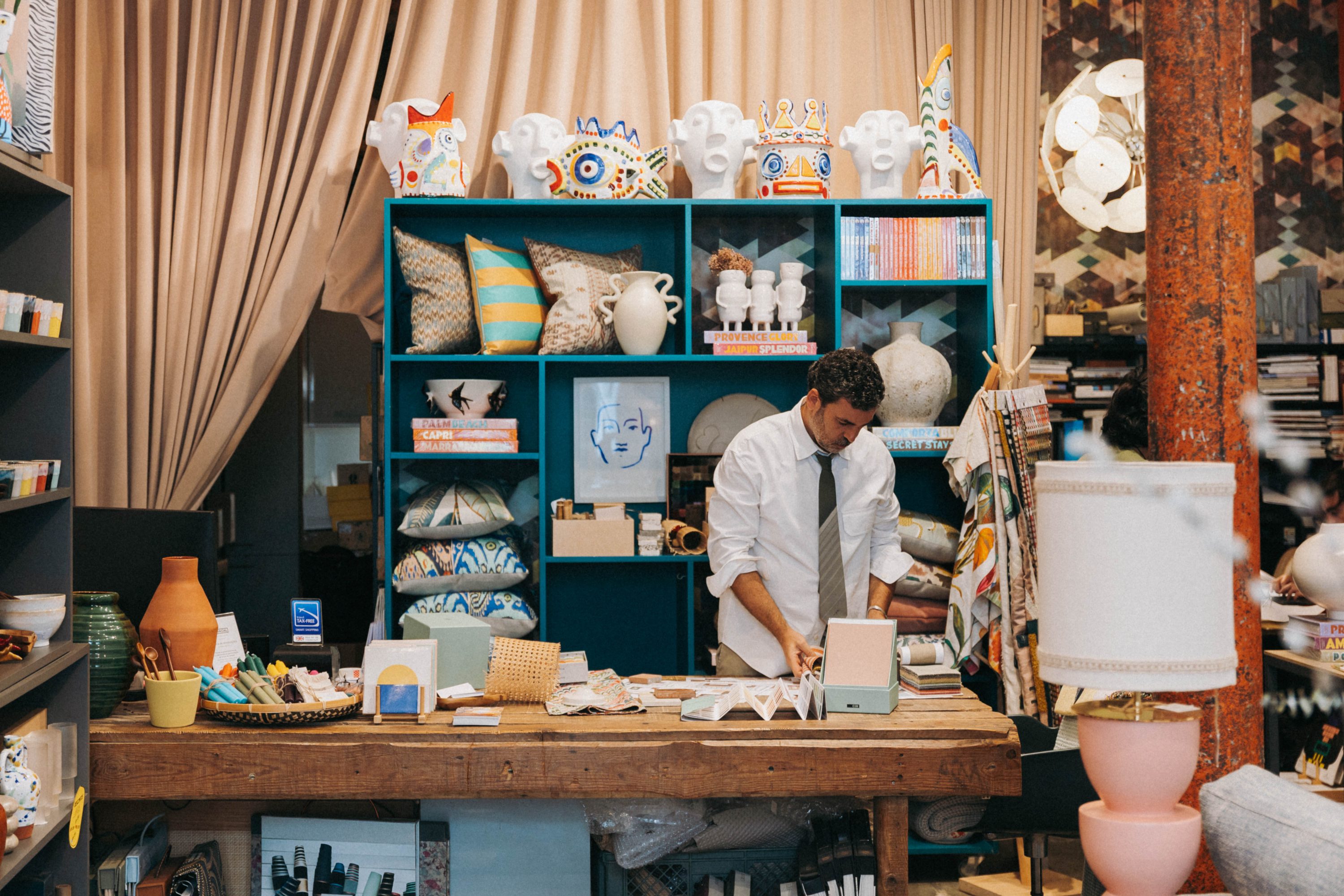
I started alone, then brought in one collaborator, then two, then five… and we worked mostly on ephemeral projects — exhibition design, a few shops in Chiado, a bar called “Parque”, a rooftop in Calçada do Combro. Smaller-scale work, but with a lot of detail and opportunity to focus on craftsmanship. We also designed objects and collaborated with galleries. Then two major turning points shaped my path. One was working with chef José Avillez — first through art installations in his restaurants, then designing the full interior architecture and refurbishing his spaces. It was a beautiful journey, growing side-by-side — he in gastronomy, me in architecture.
The second was the beginning of our collaboration with Hermès — designing their window displays, which became a true passion of mine. I love interiors. Art is my sanctuary. It’s the start and end of everything for me. But window displays are a fusion — small-scale scenographic architecture. And they’re fast! You design, submit, get approval and — boom — it’s production, assembly, disassembly. I love that tempo! Architecture can be exhausting. It’s a long journey. Displays are quick bursts of creative intensity.


You describe yourself as a hybrid creative, but your language as an artist is very distinctive. How has that language evolved?
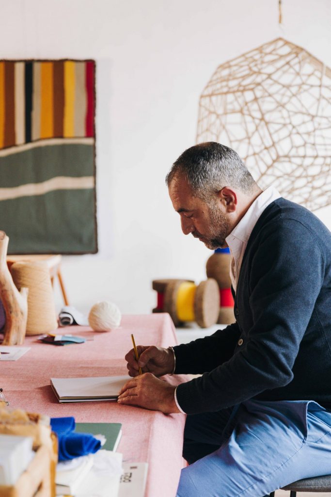
The studio’s evolution and my own creative language have been very intuitive, very visceral. I’m passionate about what I do, I’m endlessly curious. I travel, I write, I draw constantly. That’s what it takes to go far — passion and curiosity.
There’s always a sense of play in my work. A very serious kind of play, as I like to say. It’s demanding, and it requires consistency. That’s important to highlight: we’ve completed over 300 projects in 20 years, and there’s a strong through-line — rigour, attention to detail, strong concepts, and narrative depth. Every project is a unique story. That’s something I take great pride in.
This comes through in our materials palette, our colours — colour is fundamental — in textures, tactility, the sensory experience. All of these layers have shaped what’s now known as the Astolfi language. It’s recognisable. People walk into a space and sometimes say, “This must be a Joana Astolfi project.” That fills me with joy. It’s the legacy I hope to leave. One day, when I move on from this layer to the next — hopefully up to paradise — I’d love for this creative language to live on, to inspire future creatives.
You also mentioned a very important brand in your career, Hermès. Hermès has a very distinct identity. What was it like working with them, and how did your vision align?
Hermès was a wonderful, long journey — ten years of collaboration, and now we work together more sporadically. I feel like part of the family. It started very organically. I walked into the store and asked if there were any opportunities to collaborate. They had a competition, I entered, and I won. That was the beginning. Hermès is extremely demanding, with a strong conceptual and narrative sensibility — which works beautifully with my approach. We clicked. I also love working with powerful stories and bold ideas. I always tell my team: “Dream high.” For window displays, the sky wasn’t the limit — it went way beyond. But execution is everything. The idea might be great, but if the production lacks rigour, it won’t succeed. That blend of playfulness, humour, the poetic nature of mise-en-scène — it all aligns with Hermès. There’s a delicate balance between the set design and the products. The objects must breathe, while the scene needs impact. Window displays are like open-air galleries, little theatres. And that’s the beauty — they make art accessible to everyone.

You’re passionate about storytelling and objects. How do you recognise an object’s narrative potential?
I’ve been a collector since I was little. I love objects. I can’t live without them. I always carry one in my pocket — every day it’s something different. Today? A little ladybird I bought to pin on my coat.
I’m very tactile, very material-driven — maybe it’s my star sign, Taurus? I love to touch, to feel the temperature and texture of objects. They carry stories. I’m fascinated by memory, and it’s central to everything I do.
There’s also the aesthetic side — I adore beautiful things. But beauty needs depth and substance. So, when an object brings together beauty, memory, and story — maybe it reminds me of a lived experience — then it’s essential.I also enjoy working at that scale. It gives me a sense of lightness — a breath of fresh air — after working on a large space of 3000 m², for instance. Then I can spend three weeks just choosing the objects that will give soul to that space. Take the hotel at Quinta da Vacaria, for example. Interior architecture took time and space. Then came the furniture and lighting — choosing and designing large pieces like tables, chairs, sofas. Finally, we selected over 6,000 decorative objects — ceramics, glass, stone, wicker, books… All of it matters. That’s what people remember.
What’s your most colourful memory?
That’s a beautiful question… I think my most colourful moments are those I spend drawing with my daughter, Duna. Together, we imagine entire worlds where everything is possible — a place where colouring outside the lines is a celebration of freedom, and colours are used without rules or fear.
You’ve spoken about how colour plays a major role in your life and work. Is there any colour that’s off limits?
Oh, absolutely. I never use white. White is forbidden in our projects. There are a few other no-gos — plinths, pallets, pouffes… and white. Although it doesn’t start with a ‘P’ like the others, it’s definitely off the list.
It’s like giving me a blank page and asking me to draw a house. I’ll stare at it for days. I need a starting point, something to build on. Give me a stone on that plot so I can start telling the story. White paralyses me. It doesn’t feel warm. I need something that embraces me.
Colour really is central to your creative identity, isn’t it?
I’ve had many deep conversations about colour. People really associate me with it. I used to be known as Joana Mizzle, because I loved using that shade — Mizzle — a calm, in-between green. I was very into greens, that whole palette.
But recently, terracottas have taken over. It’s fascinating how colour shifts with our inspirations, our mental state, our rhythm of life. Colour has rhythm. It evokes emotion, it sets the tone. It’s ever-evolving — and that’s what makes it exciting.
Finally, could you choose three favourite colours from the Antologia collection?
I’ve been using the CIN Antologia collection a lot. I really love it — not just the palette, but also the quality of the paint, the textures. It’s truly excellent.
My top picks? Terracotta, definitely. I’ve been using it a lot. Paired with Veneziano — I love that ton-sur-ton effect. Cipreste is also a beautiful green — we used it a lot in Quinta da Vacaria, in about 12 to 15 rooms. It’s a present, calming green. And as a neutral, never a bright white, I’d choose Bege Coríntio. It’s incredibly elegant.