In a few words, how would you describe Graça Paz as an artist?
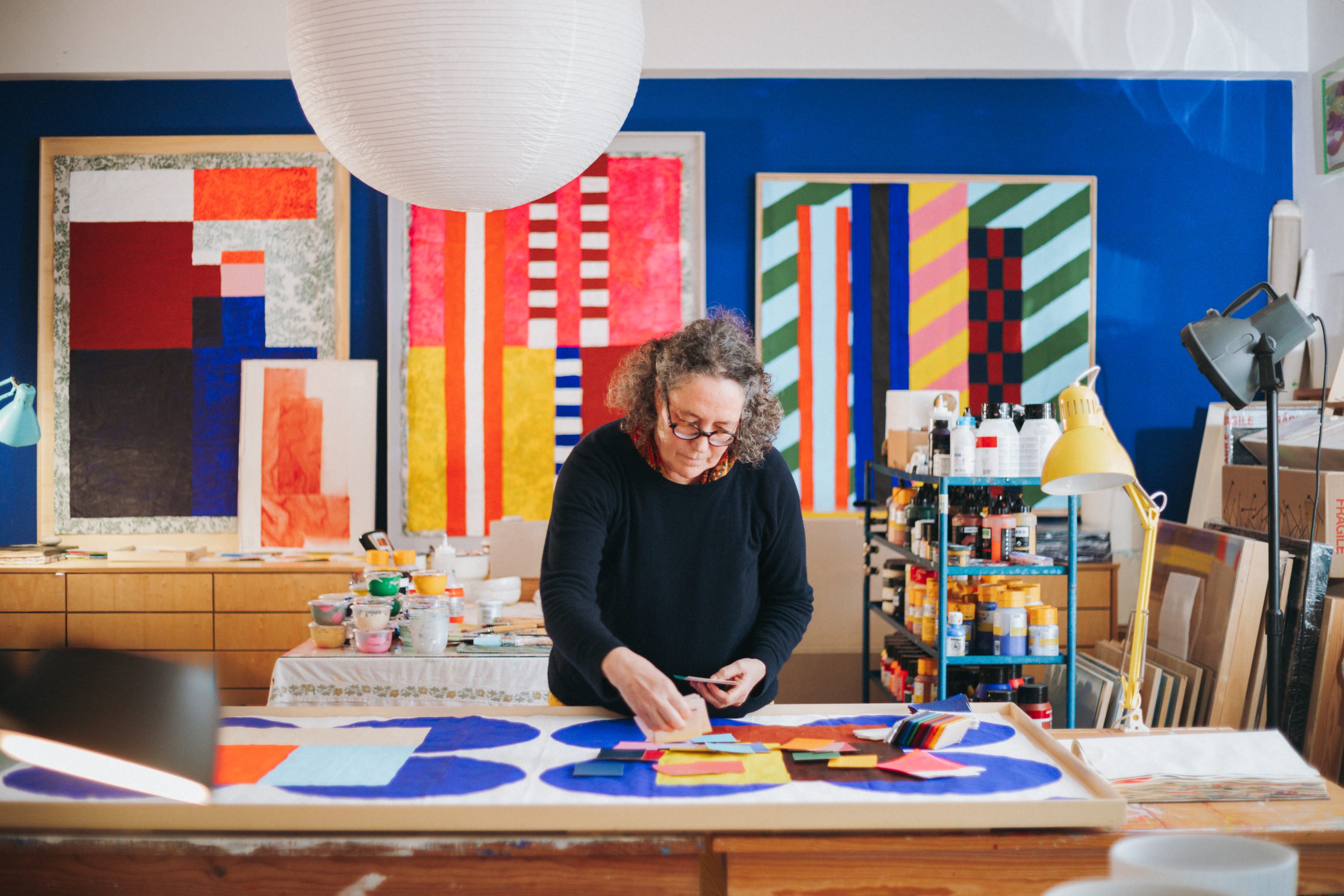
My name is Graça Paz; I am a geometric abstract artist, and my work focuses heavily on the use of colour. I live away from the city – I chose the countryside as my home, which informs my work – and I am a solitary worker. I have chosen my own process, my own way of moving within the world of art.
The environment you grew up in, closely tied to classical music, naturally had a great influence on you. Is there a specific moment you feel was “the beginning of it all”?
The classical music environment of my childhood has certainly shaped my current work; when I choose music for my studio, I tend to gravitate towards the classical. When I was little, my father would come home from work in the evening and close himself in the living room to listen to classical records. There are certain composers who calm me and get me into a great ‘flow’ for working, such as Mozart or Bach. However, I also value silence as a creative space. So, all that information from my childhood undoubtedly impacts my work. I think even the geometric aspect comes from there, as classical music has something inherently geometric about it – and a touch of the romantic, too.
How does that connection to music translate into your work today?
I believe it translates into an understanding between the space of sound and the space of silence. It manifests in my moods. There are days when I arrive and need music, and others when I need silence, and that naturally impacts what I paint. Music has become a companion, a childhood memory. I also grew up in my father’s shop, which had a very strong aesthetic sense – it was designed by architects. So, that visual world I grew up in, which came from my father and his musical environment, definitely finds its way into my work.


Your artistic language is truly distinctive. How did it evolve?
It took many years to reach a point where I found the way I truly wanted to express myself. I don’t think this process is unique to me; it’s common to all artists and people in general – first, we walk paths that aren’t quite ours, but they inform what we eventually do when we find our true way. I went through figurative art, landscapes, design, and illustration. At one point, I was asked to do a piece that required something more abstract. Suddenly, even before I was consciously working on it, I realised that abstraction was what I had been searching for. Abstraction aligns with my way of thinking, and I love the act of thinking – it’s a wonderful thing that translates into work through abstract forms. What you see here is my thought process attempting to find order. It’s a mental organisation in a world that can be quite chaotic.
How does this setting and your “escape to the country” influence your creative process?
That is a crucial question. I lived in Porto for forty years and moved here in 2009. A sense of place influences our entire biology – physical, mental, and emotional – especially when we find a place where we feel aligned, a place that feels like home even if we weren’t born there. I’m from Porto, but I felt at home here immediately. When you have that inner peace, that sense of belonging, the work flows differently. It’s influenced by that feeling and by the landscape itself. Here, I spend my life outdoors because nature invites you out; there is space, there are abstract lines in the fields, the cornfields… all of this informs my tendency toward certain shapes and lines. I only notice it when I look at my sketchbooks – I go outside to draw and realise there’s a repetition of the landscape around me that I later bring to the canvases. It’s not always like that, but where we live is fundamental to our daily work.

I read in one of your texts that “art appears to the artist as a responsibility to serve”. What would you like someone to take away after standing before one of your works?
I would like them to take away a tool that helps them find their own internal balance on a daily basis. A painting is an entity that informs a home. For example, if you place a painting with an aggressive image by your dining table, it will affect the way you eat, won’t it? People take something away when they feel magnetised by a specific work or colour. I provide the start of a conversation, but the person takes it home so it can inform their daily life, bringing balance, peace, questioning, or contemplation. A work of art is more than a decorative element; it’s an entity living with that family or person, and it has a purpose.
There is always so much colour in your art. Is colour usually the starting point?
I wouldn’t say it starts alone. Colour has always been my internal world – it’s something I know how to handle very well – but it’s not the starting point. Perhaps shapes come first. Often, I have an image of a piece in my mind that begins with forms rather than colours. Colour is intuitive; it’s an emotional relationship we have with our own palette. For instance, if someone loves red, I understand a bit about their inner world. So, colour arrives at the right moment, but it begins with form.
If you had to choose three colours to describe your work, what would they be?
I have a palette that I’ve realised remains fairly constant. They are base colours – like the “basics” in a wardrobe that you then build upon – with an open space, a vacuum in the palette for colours I feel are necessary at that specific moment.
Undoubtedly, there are the blues: Ultramarine Blue is very present; Indanthrene Blue, which is a deep, intense dark blue that encourages contemplation; and Powder Blue, which is a dustier, more muted light blue. These are always there, regardless of the phase I’m in.
That “empty space” in my palette currently holds an Earthy Red that I’ve been working with for a long time. There’s a link between the blues and the earthy red that I understand internally – it’s a need for grounding. The blue immerses us, while the earthy red roots us. It’s like having one foot in each world.
Is there any colour you dislike working with?
No, I like working with all colours, but there are certain combinations I don’t enjoy. For example, black and fluorescent Orange – I use neons a lot to bring light to the paintings, but that specific duality makes me uneasy. Orange, on its own, can be uncomfortable for me. I think orange is linked to creativity, and since I have so much of that, perhaps orange just leaves me feeling a bit overwhelmed.
What is your most colourful memory?
My most colourful memory? There is a place I return to often: Ponte de Lima, at my aunt and uncle’s farm. A large house – I must have been five, six, or seven years old. It’s an age I revisit because I felt so happy then. My parents would stay in the main house, and I would go to the caretaker’s cottage below. She was a lady always dressed in black, and the house was partitioned by floral chintz curtains – the whole space divided by fabric. I remember wandering through the house and seeing the whole family sleeping in the same bed; they were different times.
The first thing I did when I arrived was open these enormous chests, which seemed giant to me at the time. I remember the caretaker taking out a massive loaf of village bread, cutting me a slice, and saying, “Gracinha, let’s go see the chicks, let’s go see the bunnies.”
That memory is incredible to me. It’s a place I always go back to, and it is, without a doubt, vivid and colourful.